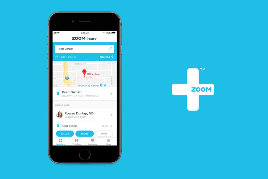
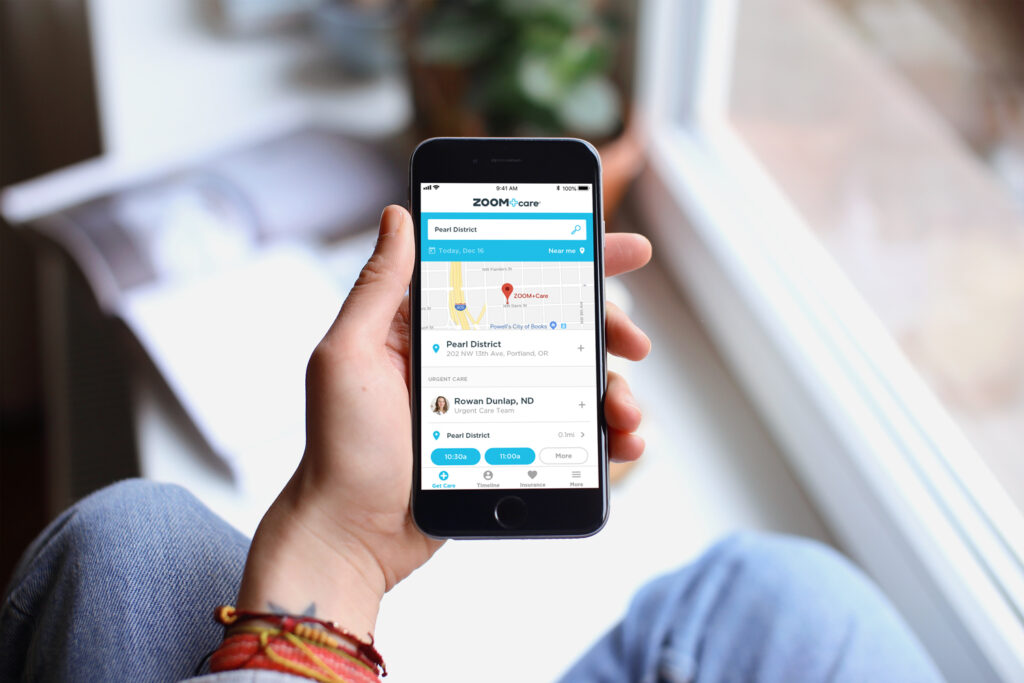
Healthcare On-Demand
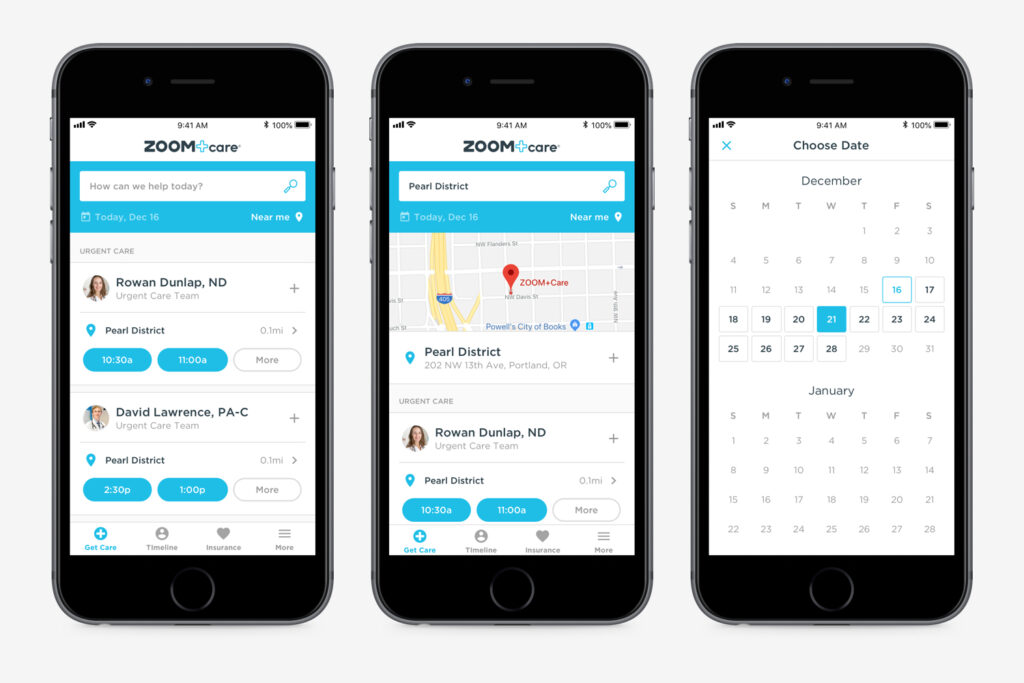
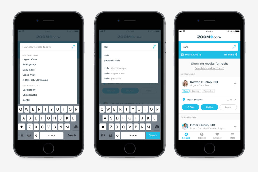
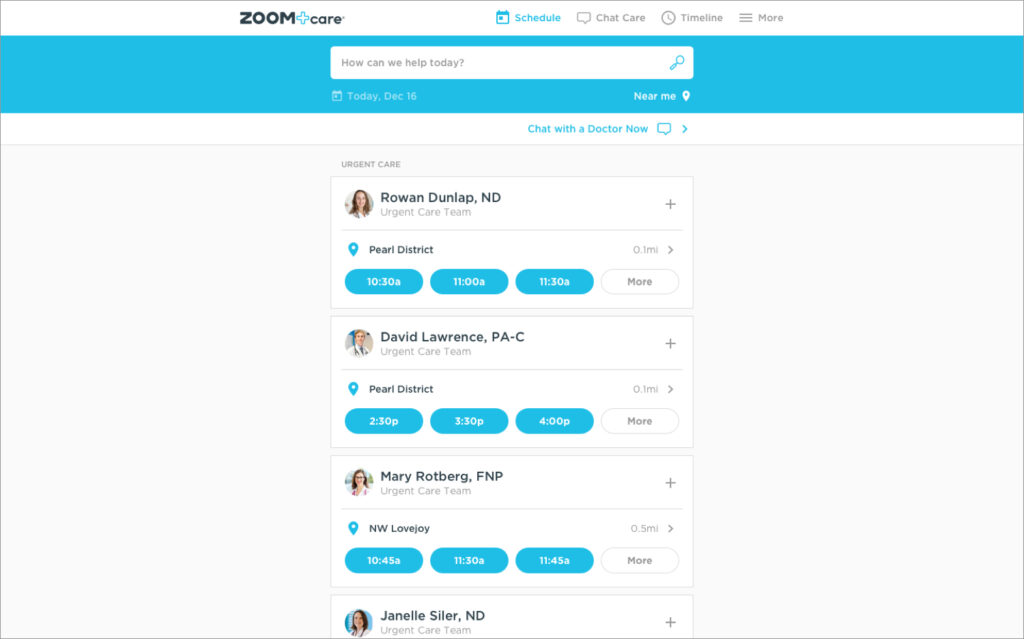
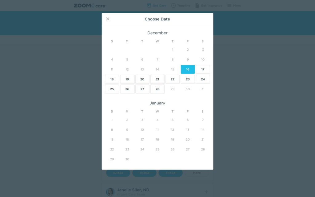
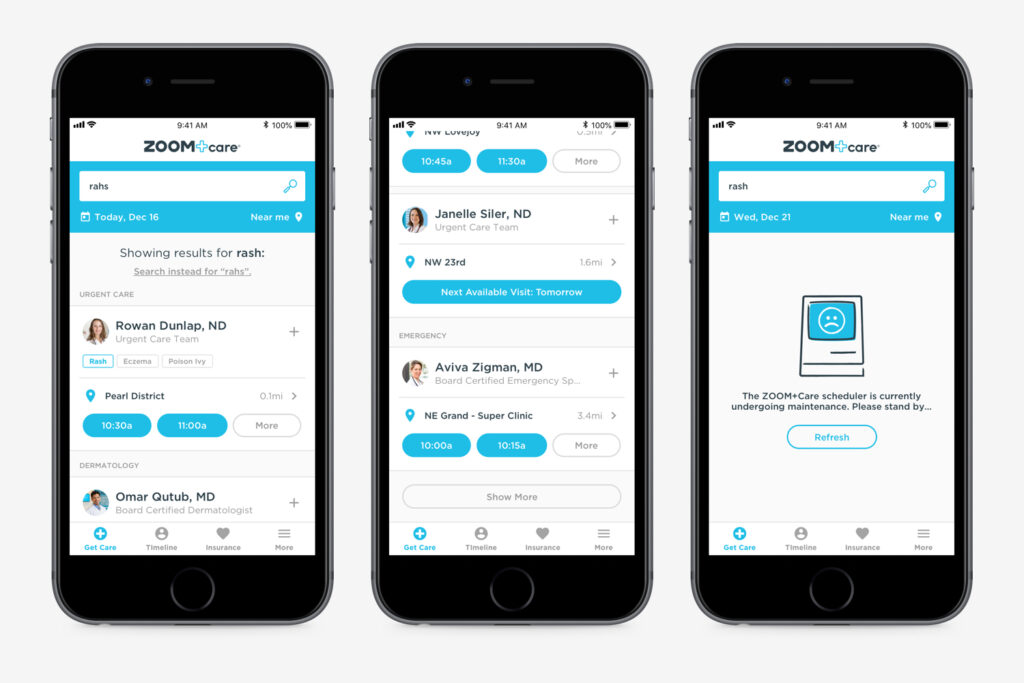
The goal of this project was to replace the current ZOOM+Care scheduler with a robust, scalable platform. After some broad exploration I took the existing AI that displayed doctors within specific clinic location and inverted it so patients focus on the providers and see locations as attributes attached to them. This improved how flexible the scheduler app could be. I also created a UI ready for implementing an intuitive natural language search.
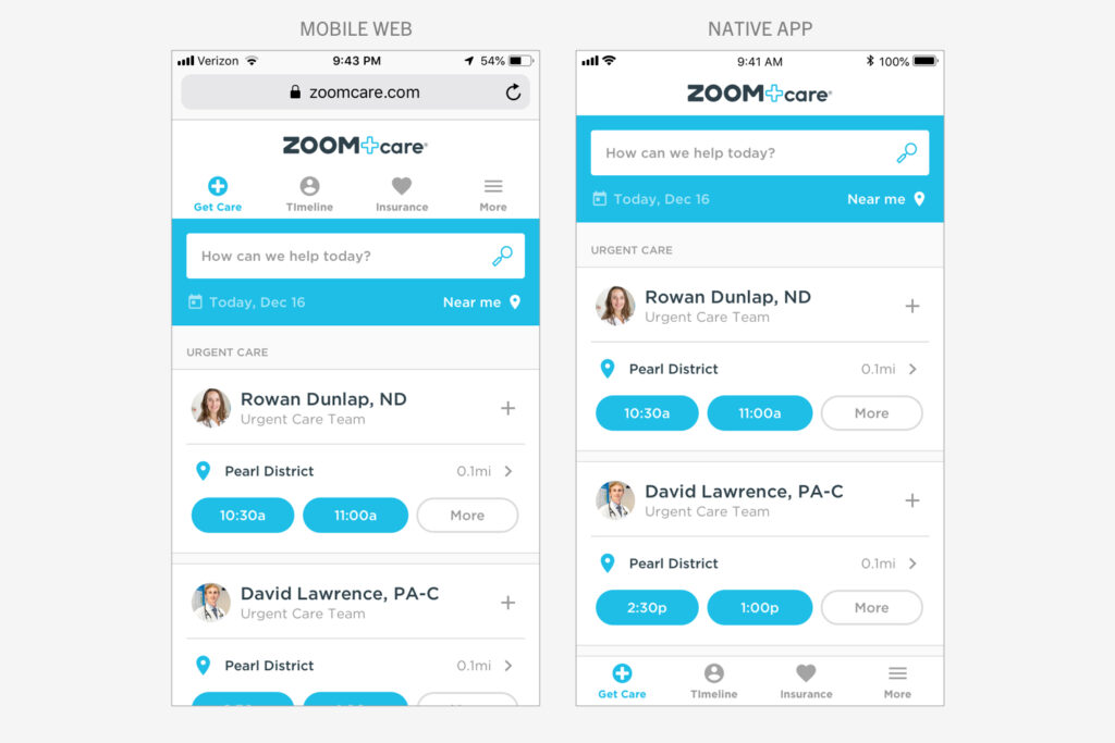
At ZOOM+Care we designed everything mobile first. This project was also truly “device-agnostic.” I collaborated closely with the other product designer on my team to create a design system that we could use across app, mobile web, and desktop web.
This scheduler app is the starting point of the ZOOM+Care experience and is the center of our brand universe. So I also worked closely with our brand team (which I used to be on) to make sure this scheduler would be an iconic and memorable representation of the brand.
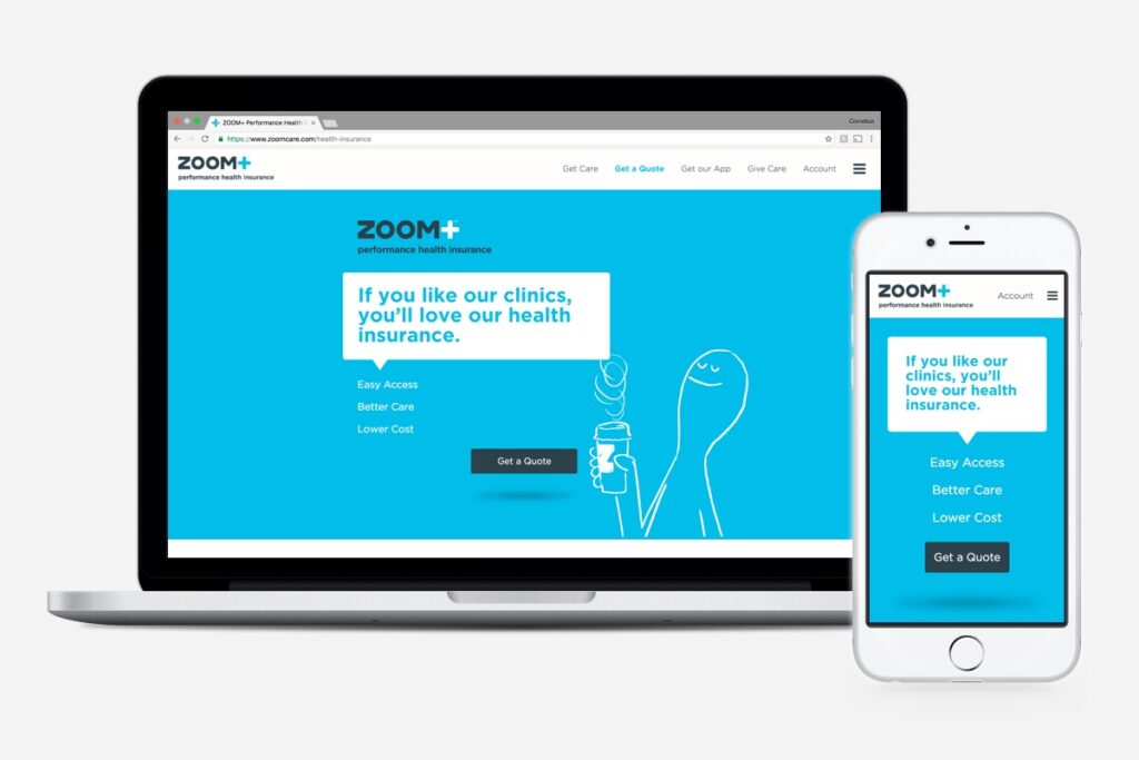
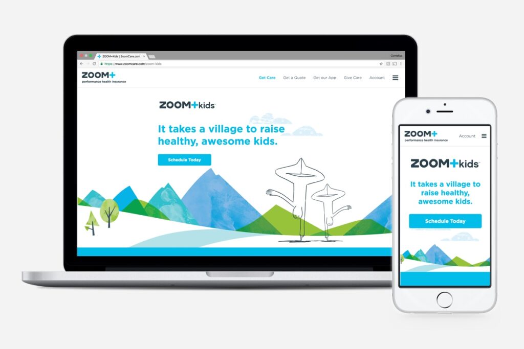
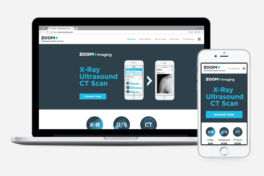
Landing Pages
As ZOOM+Care developed new categories and products, we faced a problem: how does a beloved brand that people associate with fast and simple urgent care communicate that they are now a complete care provider, while still preserving their core business?
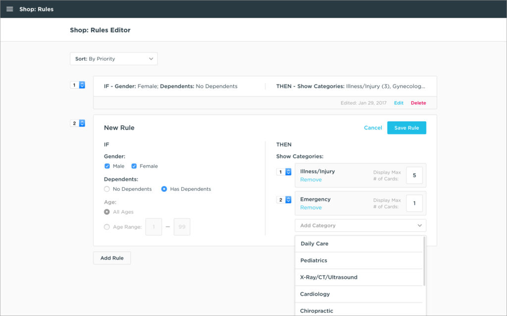
Along with a more flexible scheduling experience (above), I designed (and developed) a series of landing pages for our new care categories to help reinforce our brand and define ZOOM+Care as an on-demand neighborhood clinic, ready to meet all your healthcare needs.
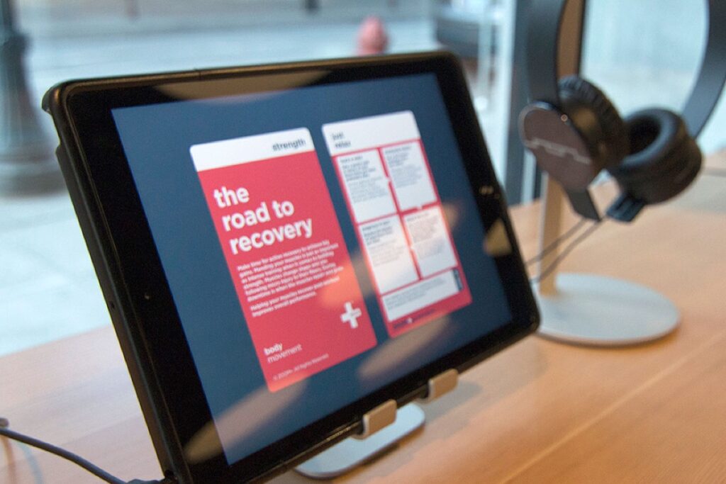
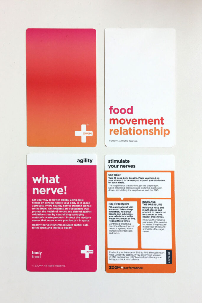
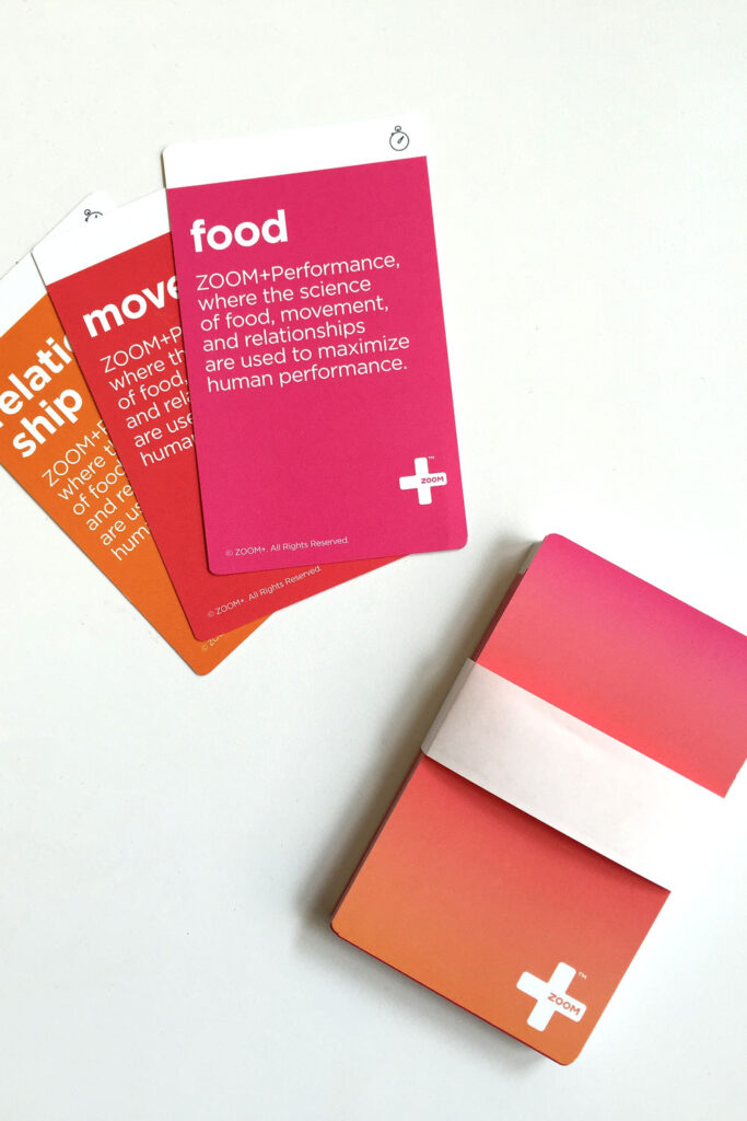
Treatment Cards and App
At ZOOM+Care, I also had the opportunity to create a deck of 40 treatment cards for our doctors to use in our flagship ZOOM+Care Performance clinic. The best part was that I got to design both the printed deck and the corresponding digital cards for the mobile app. Cards are an important metaphor in UI design so it was neat to think about “IRL” cards translating to UI elements.