Designing Wrapped
I was the design lead for Spotify’s Wrapped experience in 2020. The goal of Spotify’s “Wrapped” is to deliver a delightful year-end experience that celebrates users’ listening activity over the past year and encourages social sharing.
Wrapped is delivered on a specific day in December every year. The deadline is fixed. There is no phased rollout, no MVP, no A/B test groups or holdouts. Every Spotify user in almost every country where the app is available gets their Wrapped at the same time. This means there were all sorts of design challenges. In this case study I outline some of these challenges and how I overcame them.

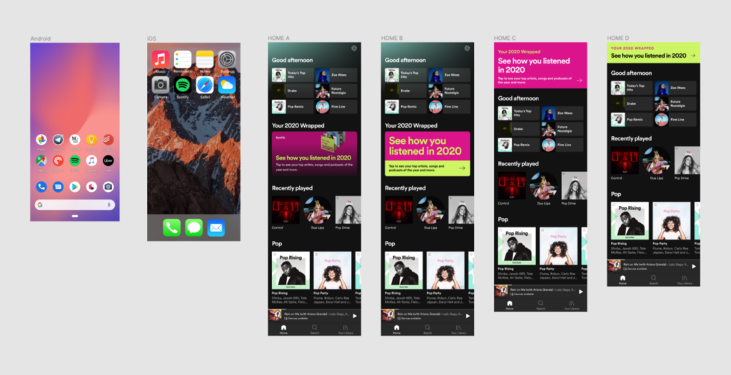
Home Tab Promo
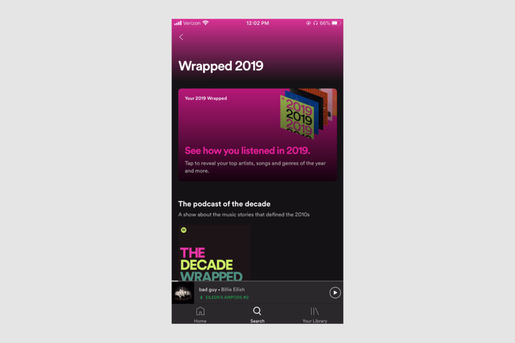
Because Wrapped only exists for a few days it needs to be front and center when users open Spotify. The Spotify Home tab is prime real estate, so my product manager had to work hard to get space there for even a few days. The existing “Home Banner” that is used to advertise new songs and podcasts had been used in the past, but really did not lend itself well to getting users excited about their year-end Wrapped experience.
I worked with a user researcher on my team to test a variety of locations and form factors for promoting Wrapped on the home screen. Once we identified the best location, I explored a lot of different styles, before landing on a specific look and feel. The most exciting part is I was able to incorporate the groovy gradient animation I developed into the promo banner on the home screen. Having animation in a place that is virtually always static was really effective in drawing users into this celebratory moment.

Interactive Story Container
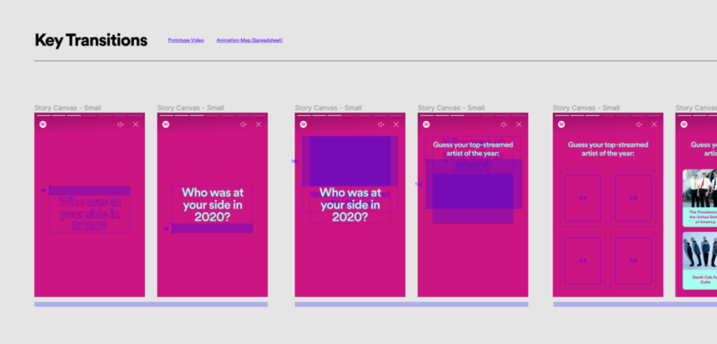
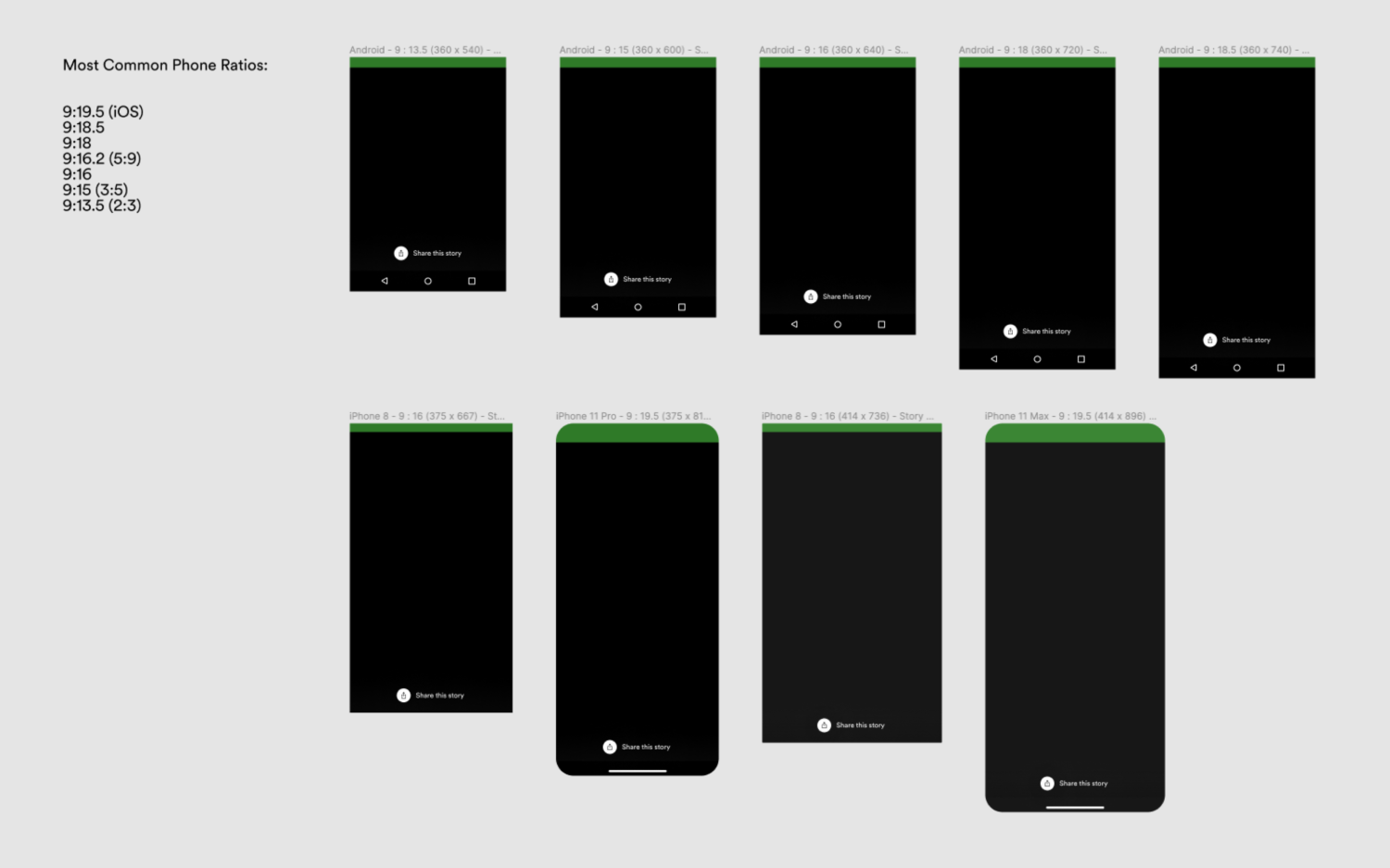
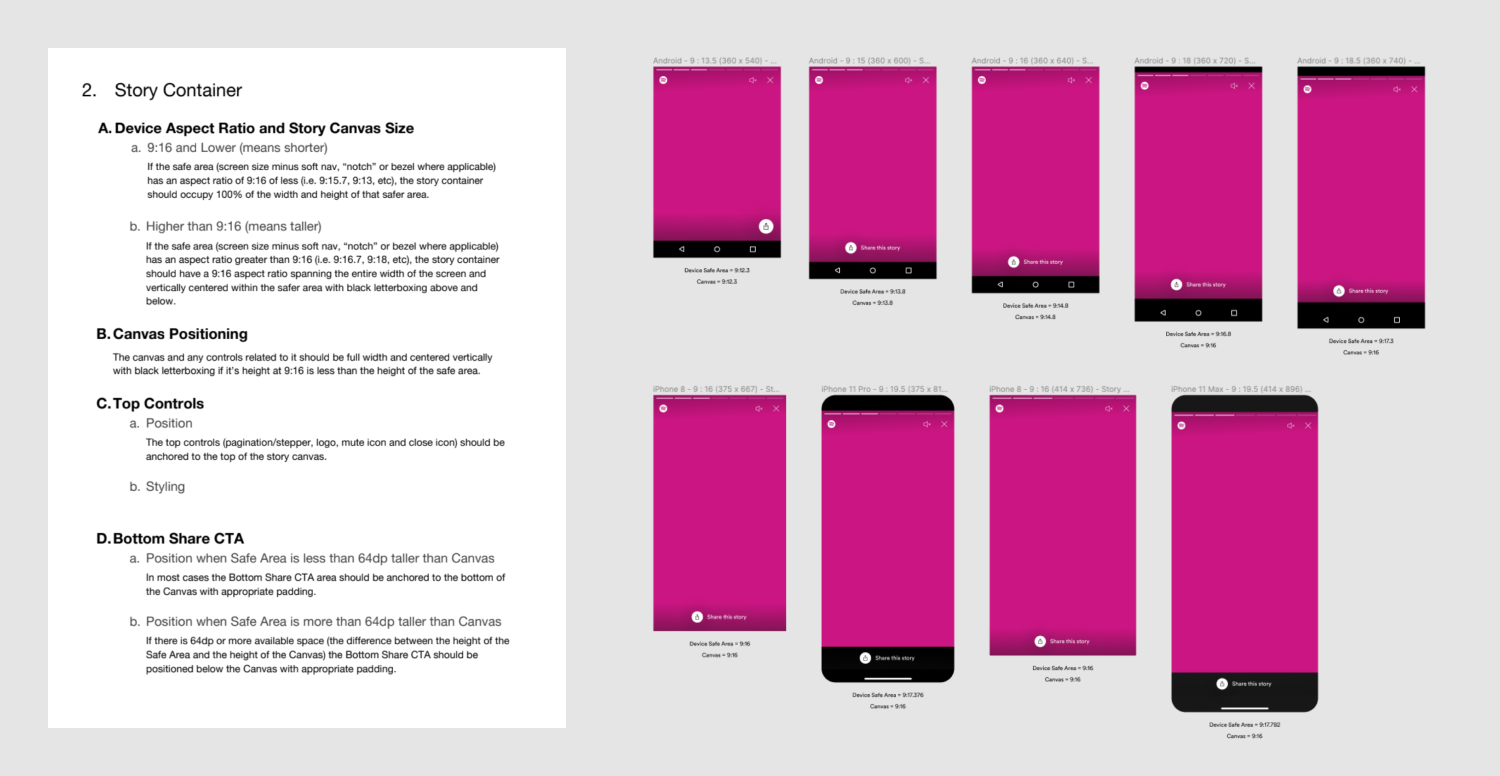
In the previous year all of the stories were built on a rectangular canvas with a locked aspect ratio and all of the elements absolute positioned. This rectangle was just scaled to fit whatever device Wrapped was used on. We knew however that Wrapped was going to be used on many different types of mobile devices across the world and that simply scaling a locked canvas would not provide a great experience for everyone.
I created an adaptive and responsive framework for the story container with guardrails and parameters as well as a set of 4 canvases to design for in order to cover the most common device sizes used. I carefully wrote specifications to ensure that users with larger and smaller devices would have an ideal experience that adapted to their device.
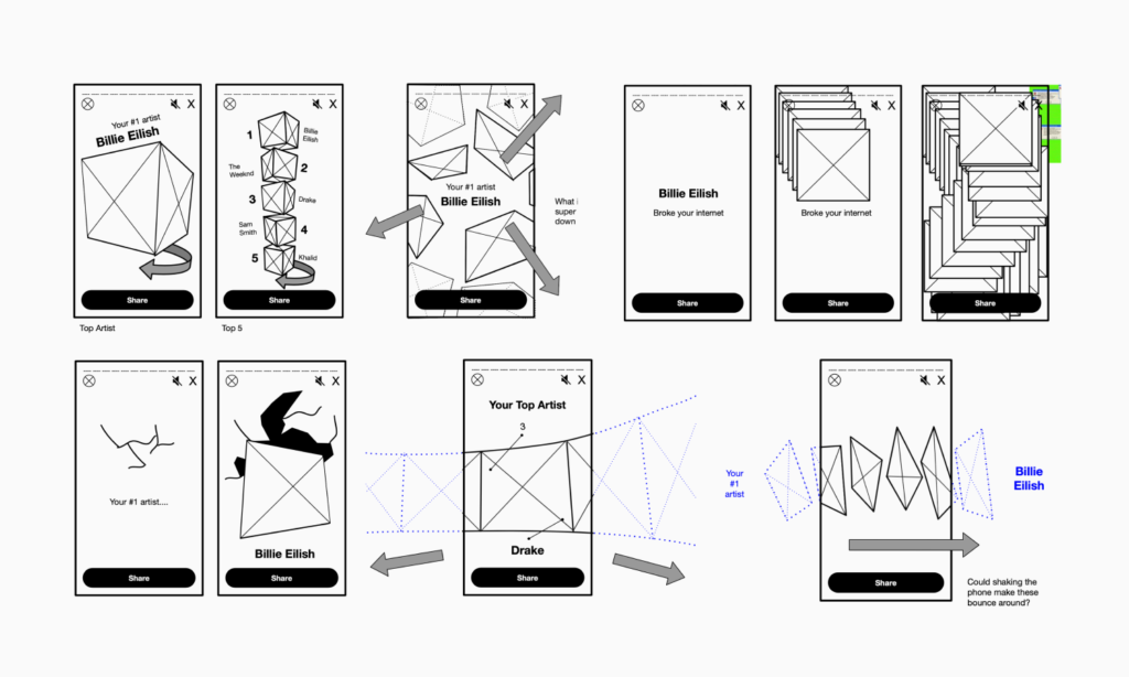
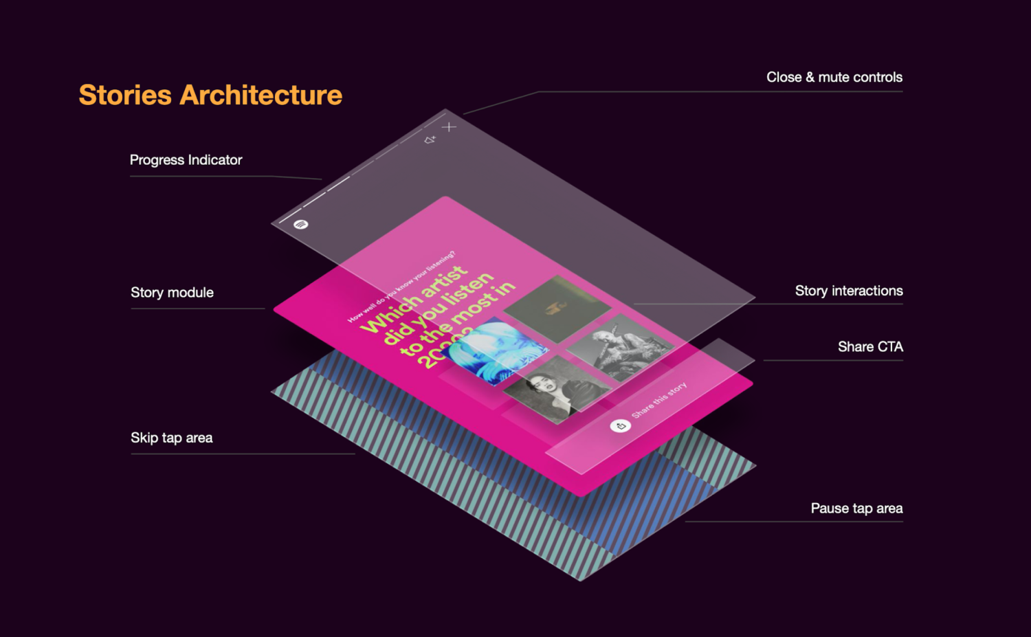
Another important factor I focussed on was making sure this new story container had an interactive layer so we could make sure that interactive elements would exist over top of any built in story controls. This was the first time Wrapped had stories with user interaction so we wanted to get this right.

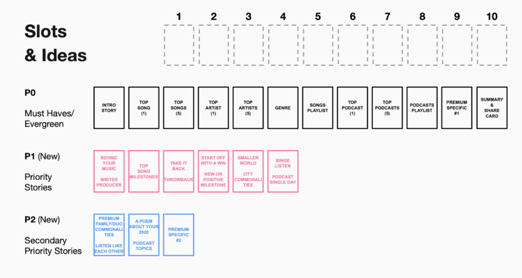
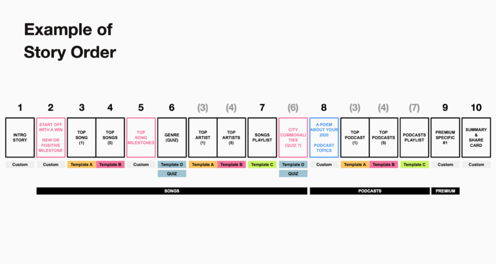
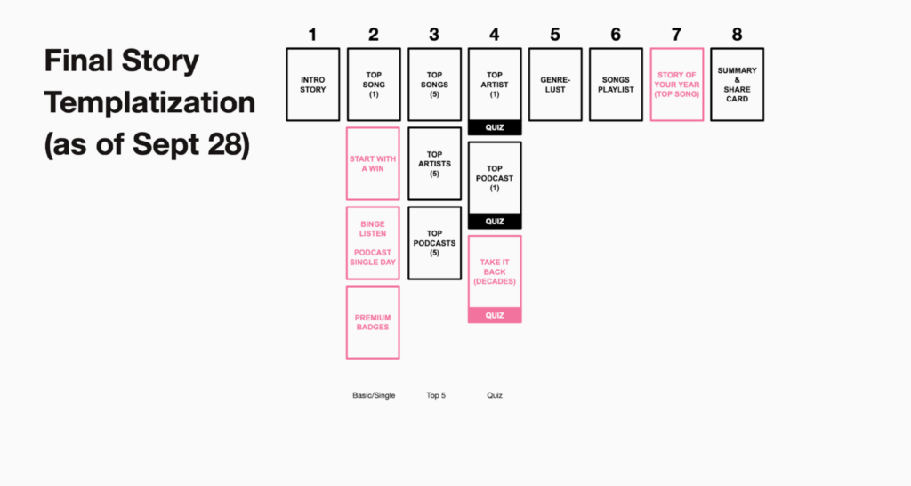
Modularity & Templatization
We knew that with a fixed timeline things could get dicey, so in preparation for that we explored options for how we might help our engineers work faster, while creating “guard rails” to steer our conversations with Spotify’s Brand & Creative Team. We knew that the worst thing that could happen was having to ask our engineers to build twenty-something custom stories on a very tight timeline.
My goal was to create a system for composing stories that would balance flexibility and reusability. I originally explored creating a kit of parts that could be used to quickly assemble hundreds of different stories with minimal engineering effort and maximum variety.
Where I ended up landing was more of a hybrid approach – a mix of rigid reusable templates where we only changed color, copy and images and a handful of very custom stories. I carefully arranged the order of these to give the greatest impression of variation possible.


Interaction & Animation
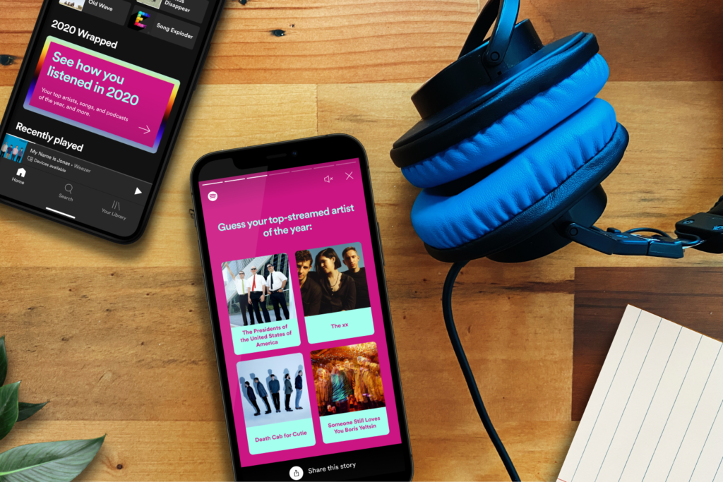
A key differentiator between Wrapped 2019 and Wrapped 2020 was interaction. We were inspired by the quizzes in Instagram stories and how engaging those are. We hypothesized that a user interacting with their stories might encourage them to want to share it. I sketched a lot of crazy ideas, but we landed on the quiz story template as our foray into interaction to test that hypothesis.
The animation is one of the most iconic elements of Wrapped. Each year there’s a new look and feel that includes how everything moves. I created an animation system where everything would either fade & move or fade & grow. The move/grow duration was always 50% longer than the fade duration. These smooth and consistent motifs played well with the slow persistent movement of the gradient animation.
As we got close to our deadline our team borrowed more and more engineers from across the organization. It would have been very difficult to be constantly collaborating 1:1 with so many engineers across NYC, London and Stockholm, so I developed a system for specking out the animations in as much detail as possible. This included redlines of the beginning and ending states of each key movement, Principle prototype videos and a Google Sheet detailing each object and how it’s attributes were being manipulated over time.